Unveiling Stader's New Brand Identity
We are thrilled to announce a new brand identity for Stader!
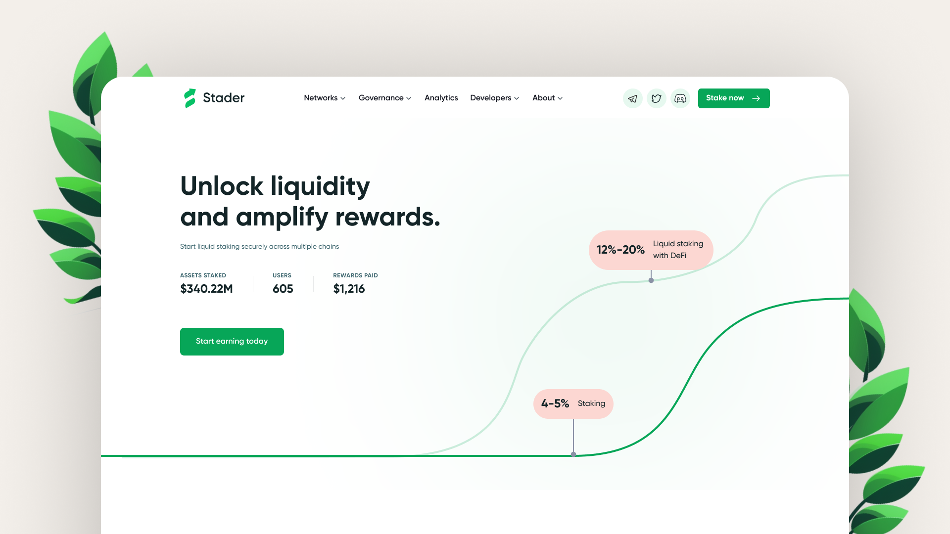
Stader was launched two years ago to disrupt the status quo of the staking ecosystem. We knew that liquid staking and DeFi is the future. And we wanted to make it easier than ever for people to join it.
As a liquid staking platform, our mission is to bring onboard the next billion users into the world of staking and DeFi opportunities. We aim to achieve this mission by providing:
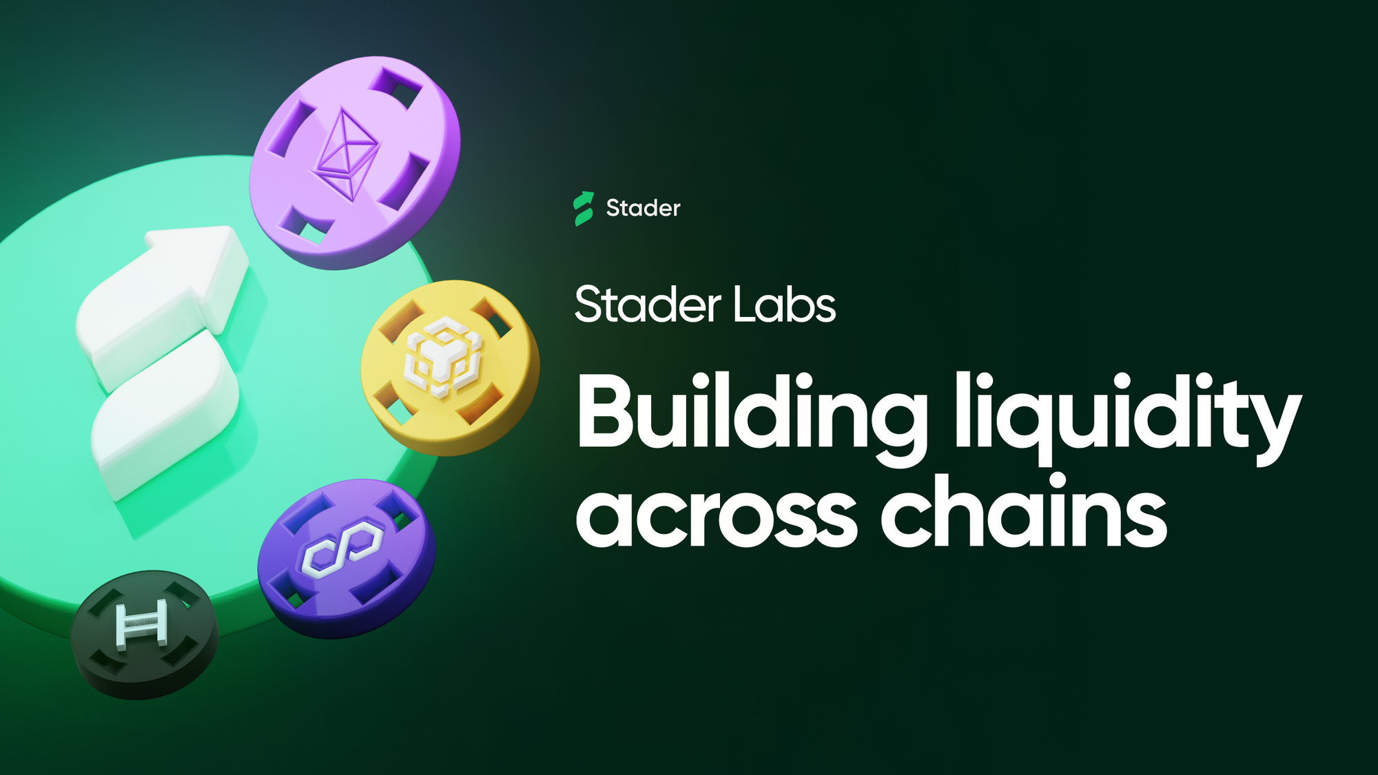
- Convenient liquid staking across multiple chains
- Instant liquidity, DeFi opportunities via top protocol integrations
- Secure and safe staking backed by multi-layer security and multiple audits
We believe that by making staking simple, accessible and secure, we can enhance the adoption and unlock the potential of liquid staking and contribute our bit towards a more decentralized crypto ecosystem in the future.
What Changes and What Remains the Same?
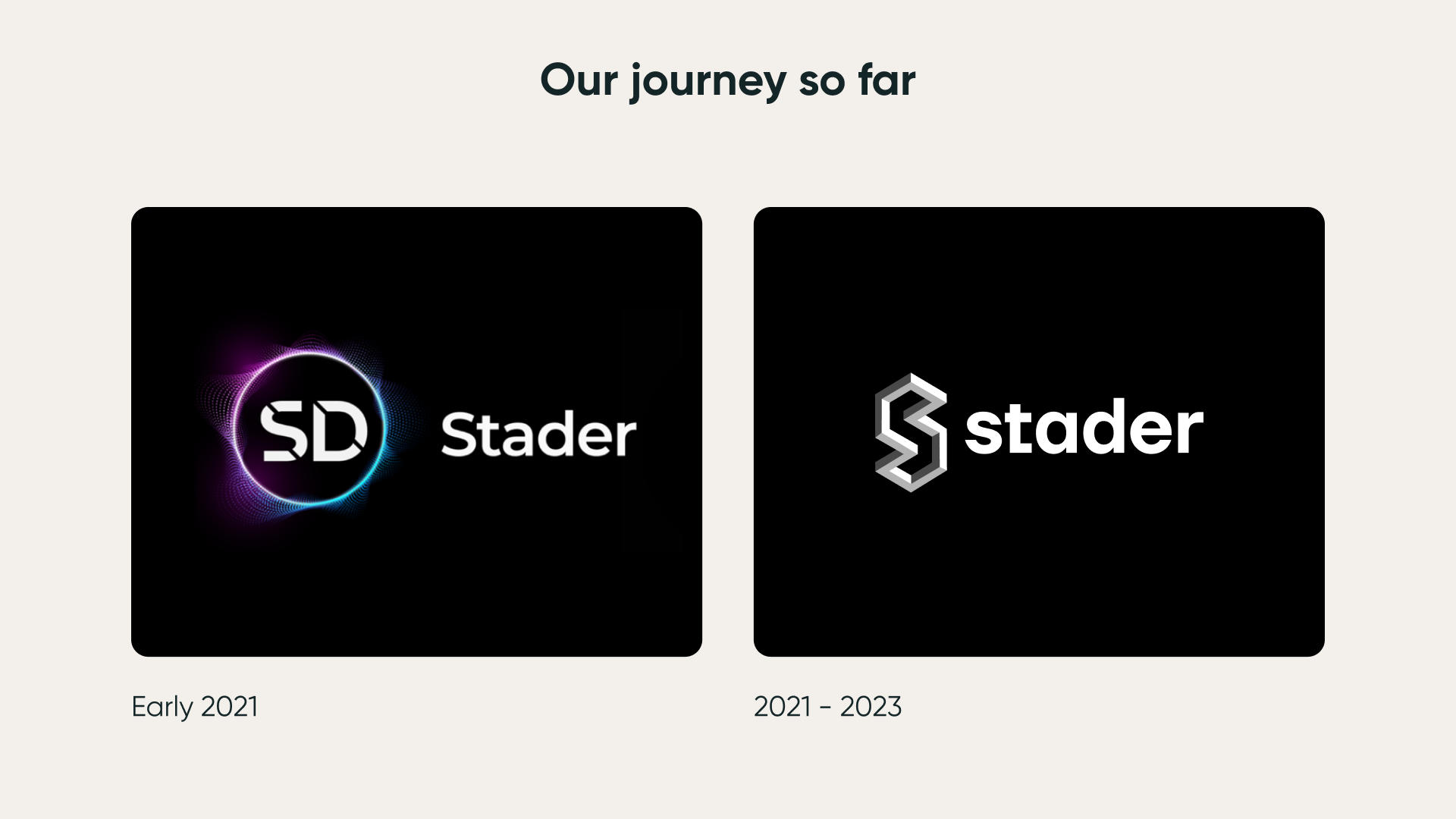
Stader protocol has gone through an exciting and transformational journey since we started out, and today, we embark on a journey to develop a fresh brand identity that would better represent who we are and what we stand for.
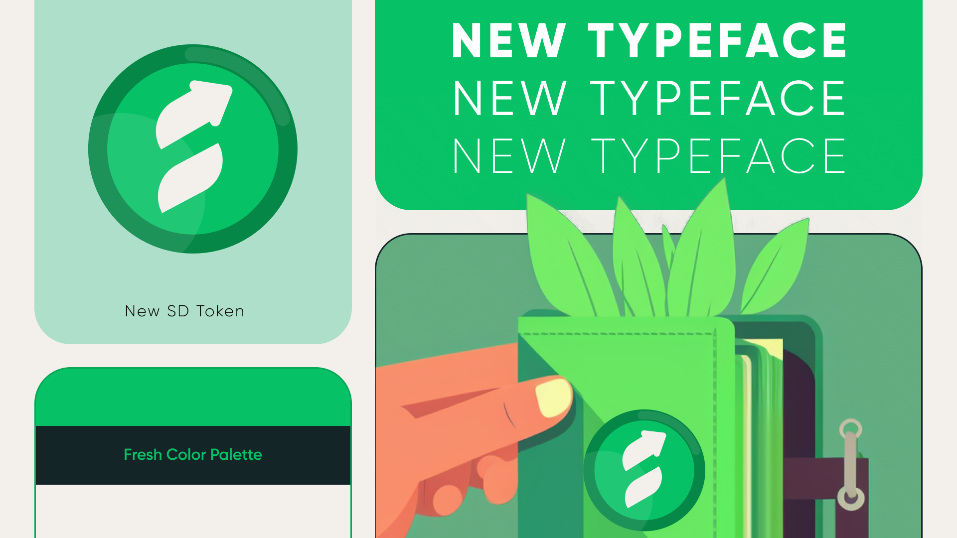
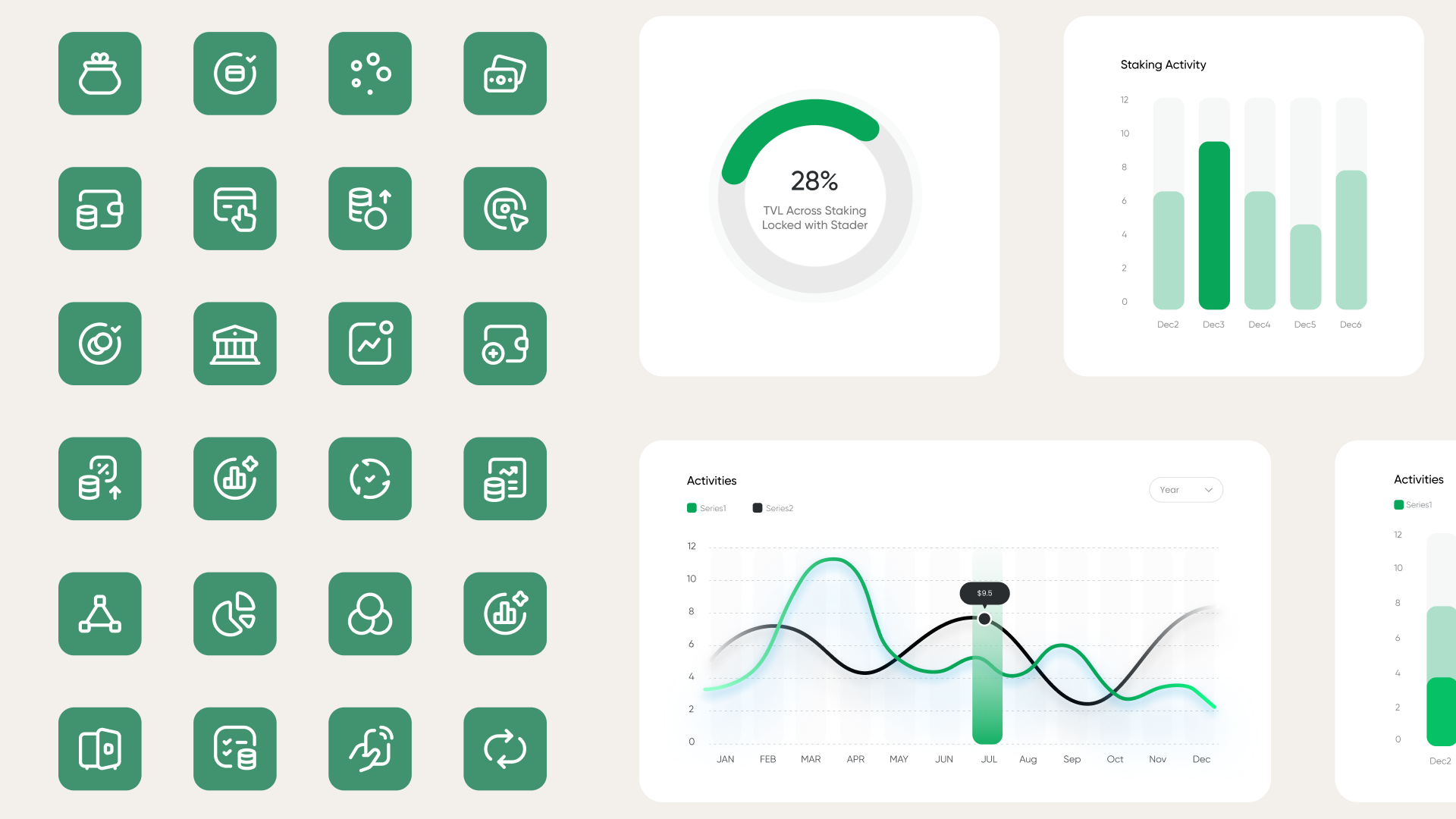
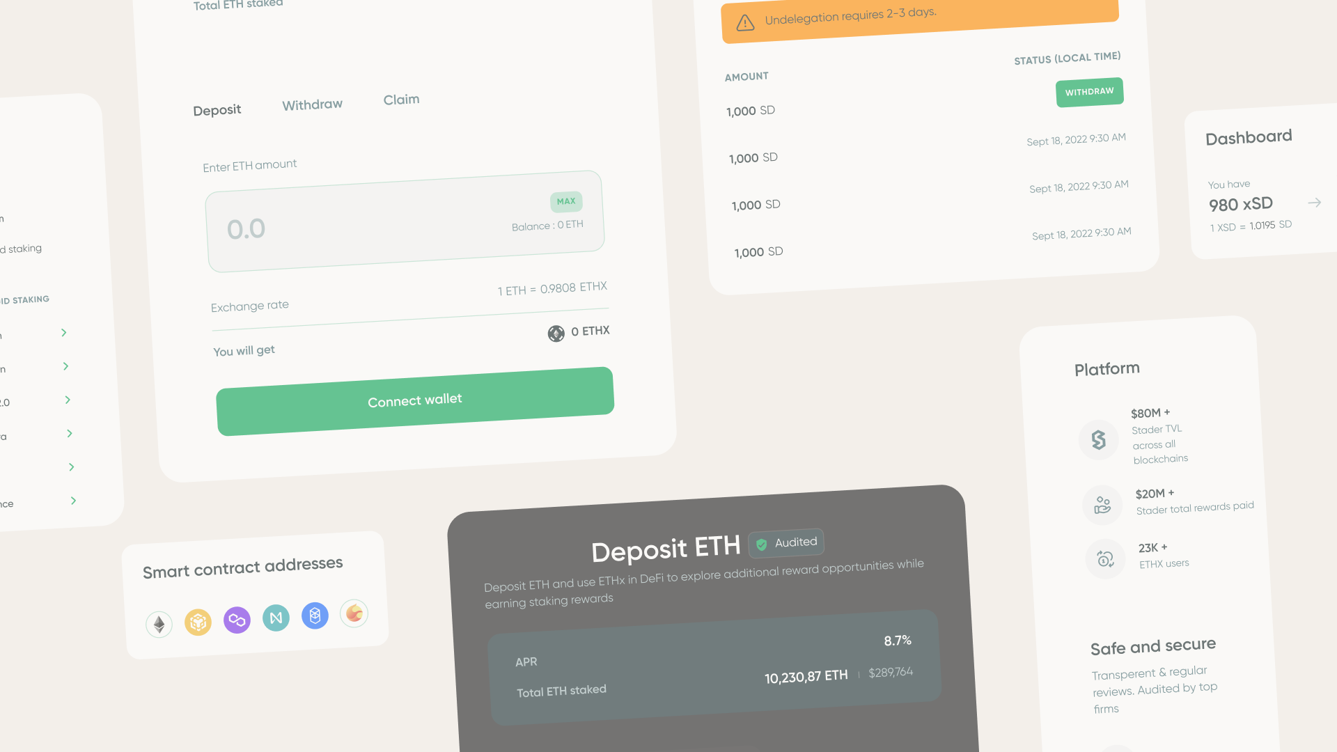
So what changes? Our entire visual identity which includes palette, typography, icons and illustrations and hence from now on we will have a new brand logo, SD token logo, website and DAapps interface, social and other media creatives across channels.
What remains the same? Our commitment and offerings to our users. This change does not affect our core values. Instead, it just emphasizes them. We are as committed as ever to the safety and growth of our users, and to bring them the best possible liquid staking experience.
The New Brand Identity
To manifest this change across the new brand identity, we did deep design-thinking along with first-hand discussions with several crypto users. For most crypto users and Stader DAO community members,
- The new logo and green hue represents security, stability and growth
- The typographic cue stands for trustworthiness and approachability

Our rebrand is built around the ethos of secure, sustainable Growth. The new color scheme, Dapps, illustrations and other visual elements have been designed to denote visual dynamism, and energies that represent stability, trust and accessibility in a subtle yet expressive style.
It makes us proud to unveil our new brand identity and look, that truly embodies our purpose, to the world as we strongly believe that it will help us to better communicate our brand message and values to our customers, stakeholders, and the wider community.
So here we are! Pumped about this new chapter in our company's journey, while looking forward to continue innovating and growing our platform in the years to come. Thank you for your continued support, and we can't wait to see what the future holds!